UX/UI Design
THE GULU
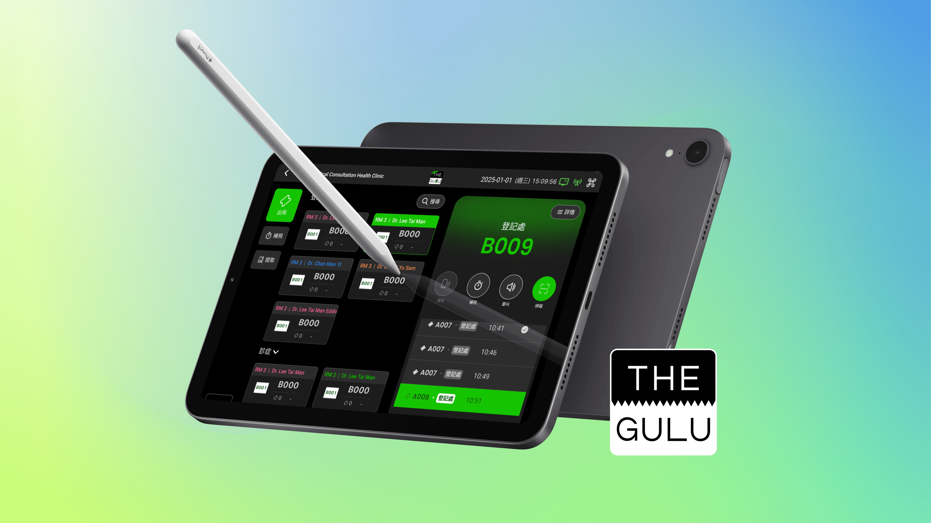
Validated concepts and optimized user workflows for their shop app. Improved key metrics like engagement and task completion rates by 12%.
Validated concepts and optimized user workflows for their shop app. Improved key metrics like engagement and task completion rates by 12%.


Product
Shop App Revamp
Company
THE GULU
Created On
2024

Overview
THE GULU's leading ticketing system used by over 3M+ customers across across the F&B, healthcare, and education industries.
ABOUT THE GULU >> https://biz.thegulu.com/
Role
As in-house designer for THE GULU, I validated concepts and optimized user workflows for their customer-facing applications, kiosks, and web portals. I collaborated cross-functionally with managers, tech teams, and stakeholders to deliver digital experiences that improved key metrics like engagement and task completion rates by 12%
Complex User Flows in Healthcare


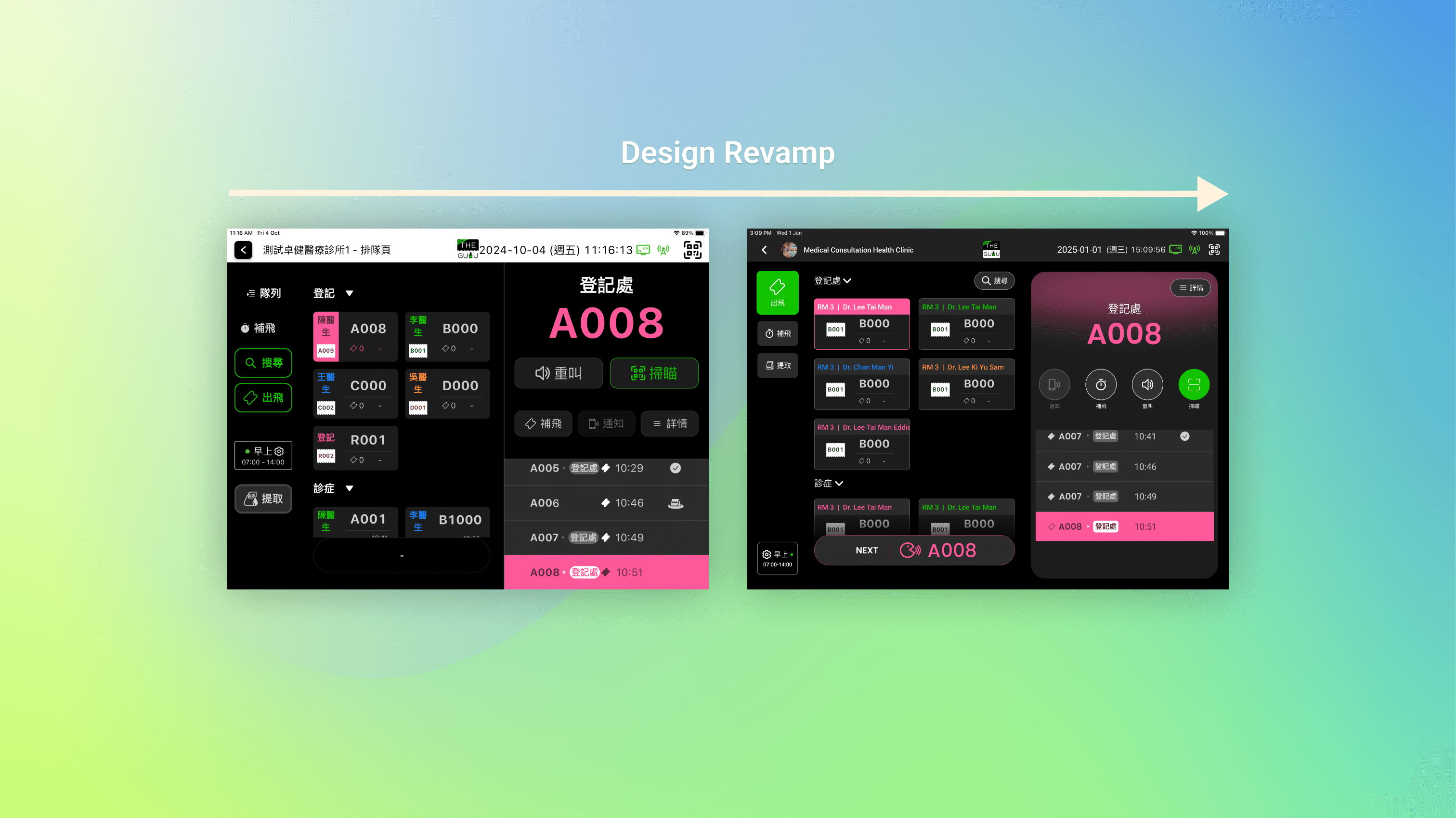
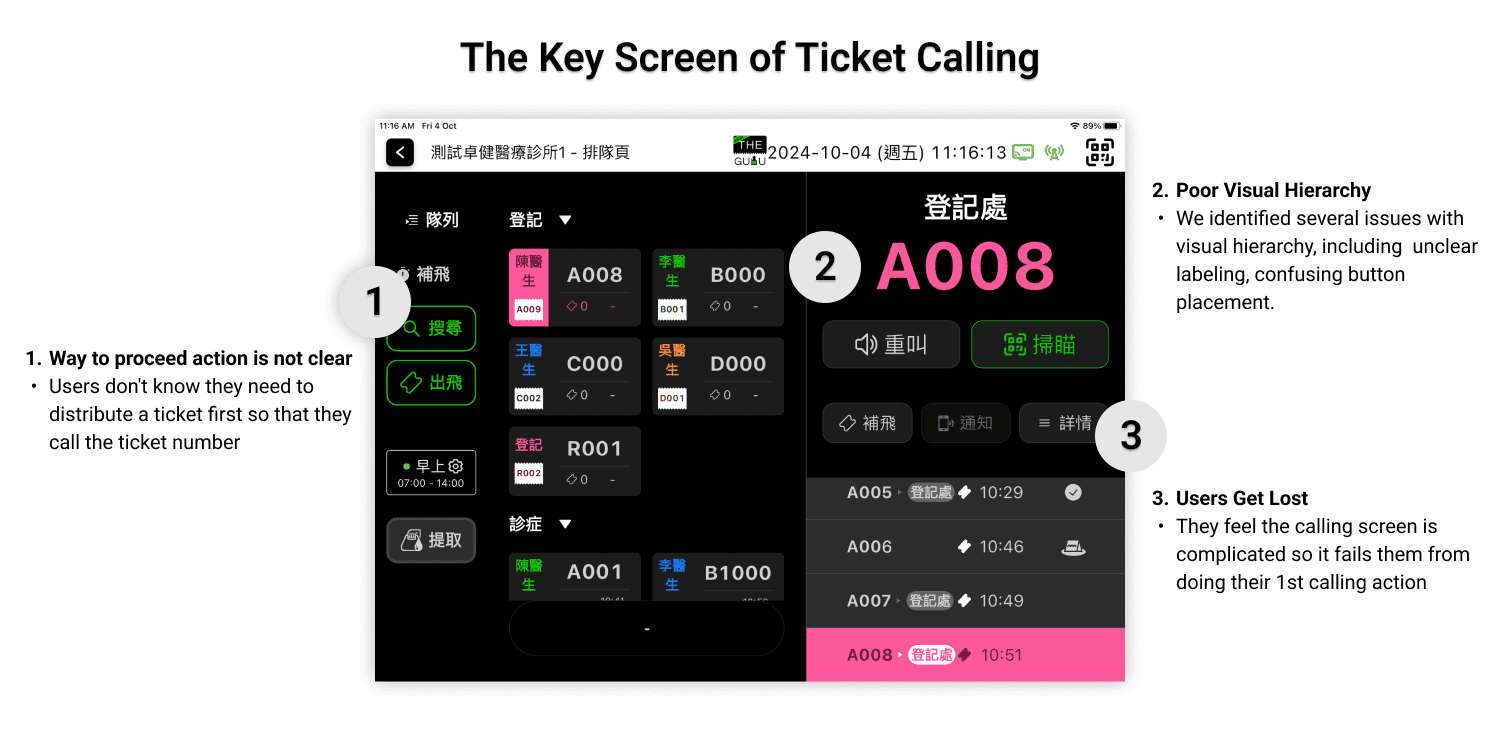
The shop app has been used for several years without UI updates, while THE GULU is expanding ticketing system across F&B to healthcare industries.
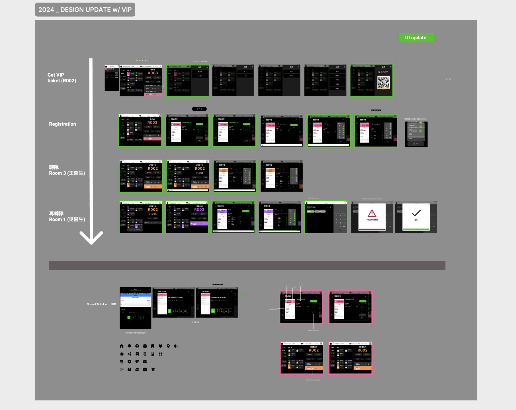
Healthcare industries require more complex flows, such as check-in processes and queue transfers to different rooms for various diagnoses.
Problems Identified
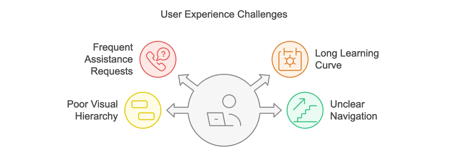
Frequent Assistance Requests
Issue: Not only Users (Mainly Nurses), but also sales team, frequently need assistance and have questions about the flow and function.
Impact: Increases support workload and reduces user satisfaction.
Long Learning Curve
Issue: User interviews with clinic nurses indicated that it took an average of 2 Days to learn how to use the system effectively each time it was installed. Also, it revealed that the shop app UI felt outdated and unintuitive, leading to frustration and difficulty completing tasks.
Impact: Delays in onboarding and decreased productivity.
Poor Visual Hierarchy
Issue: Heuristic evaluation identified several issues with visual hierarchy, including unclear labeling, confusing button placement.
Impact: Leads to user frustration and errors.
Unclear Navigation
Issue: Navigation bar is not clear enough, users frequently struggled to locate key functions due to the unclear navigation bar.
Impact: Increases bounce rates and decreases user retention.
Research Methodologies
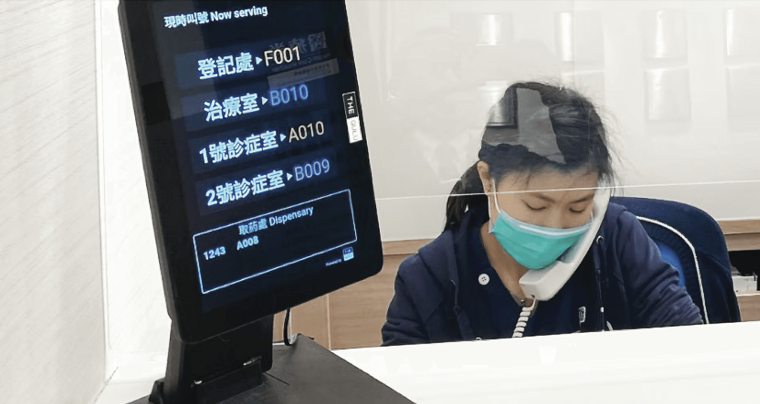
Our team prioritizes user research to inform design decisions, we partner with the Sales team to leverage their insights and access to users.
Conducted interviews with target users (specifically nurses) to gather qualitative data. Aimed to understand their challenges, and workflows.
Focus on Qualitative Data: We can identify pain points and opportunities for improvement. The goal is to create solutions that directly address user feedback and enhance their experience.
Solution
Addressing Frequent Assistance Requests & Long Learning Curve:
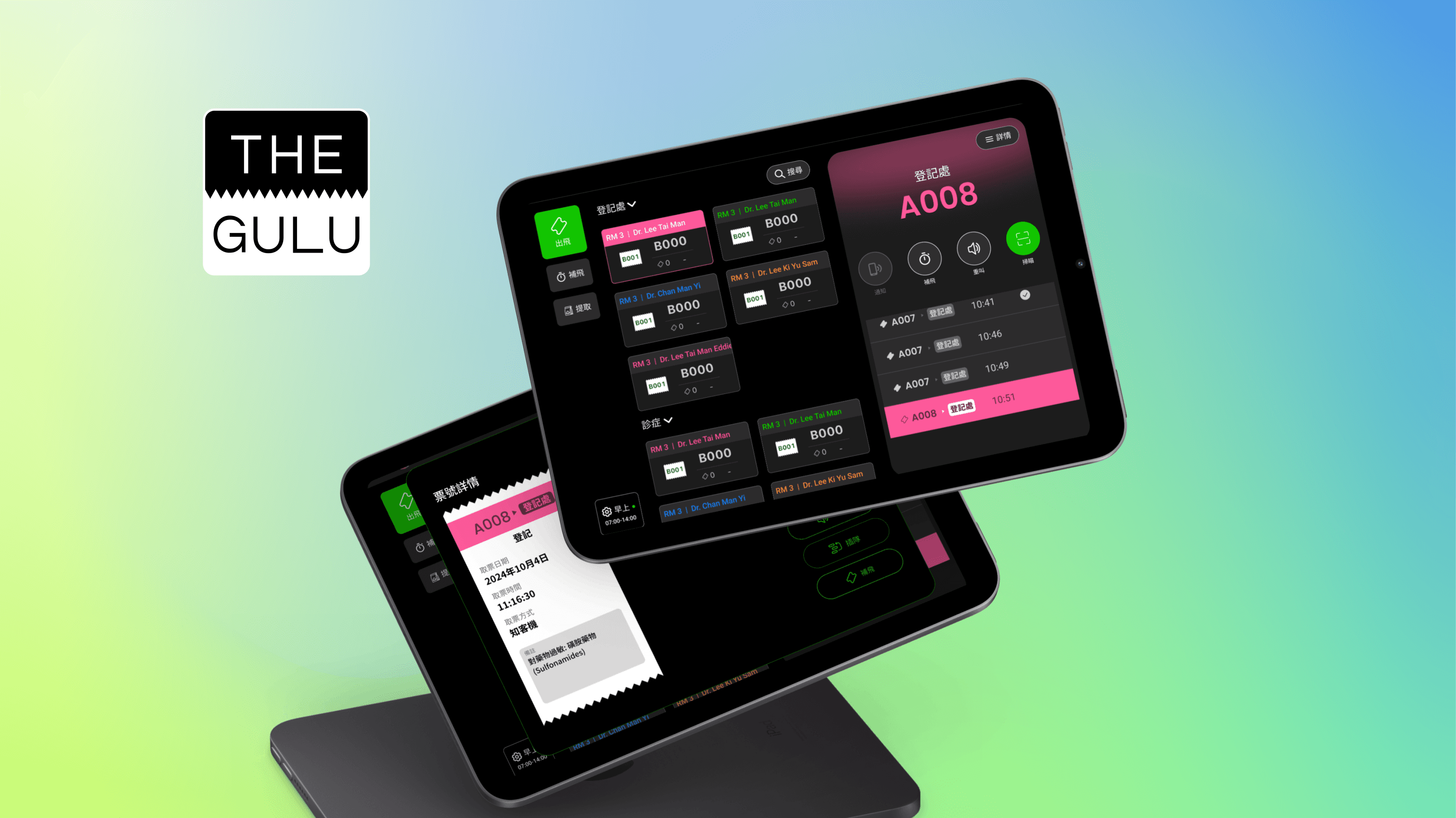
Simplified Workflow Design: Redesign the core workflows, particularly for check-in and queue management, to be more intuitive and efficient:
Task-Based Navigation: Organize the interface around specific tasks rather than relying on a complex menu structure.
Visual Progress Indicators: Clearly show users their progress through the check-in process with clear icon.
Clear Confirmation Screens: Implement confirmation screens after each critical step to minimize errors and provide opportunities for correction.
Error Prevention: Design forms with input validation and clear error messages to guide users towards correct data entry.
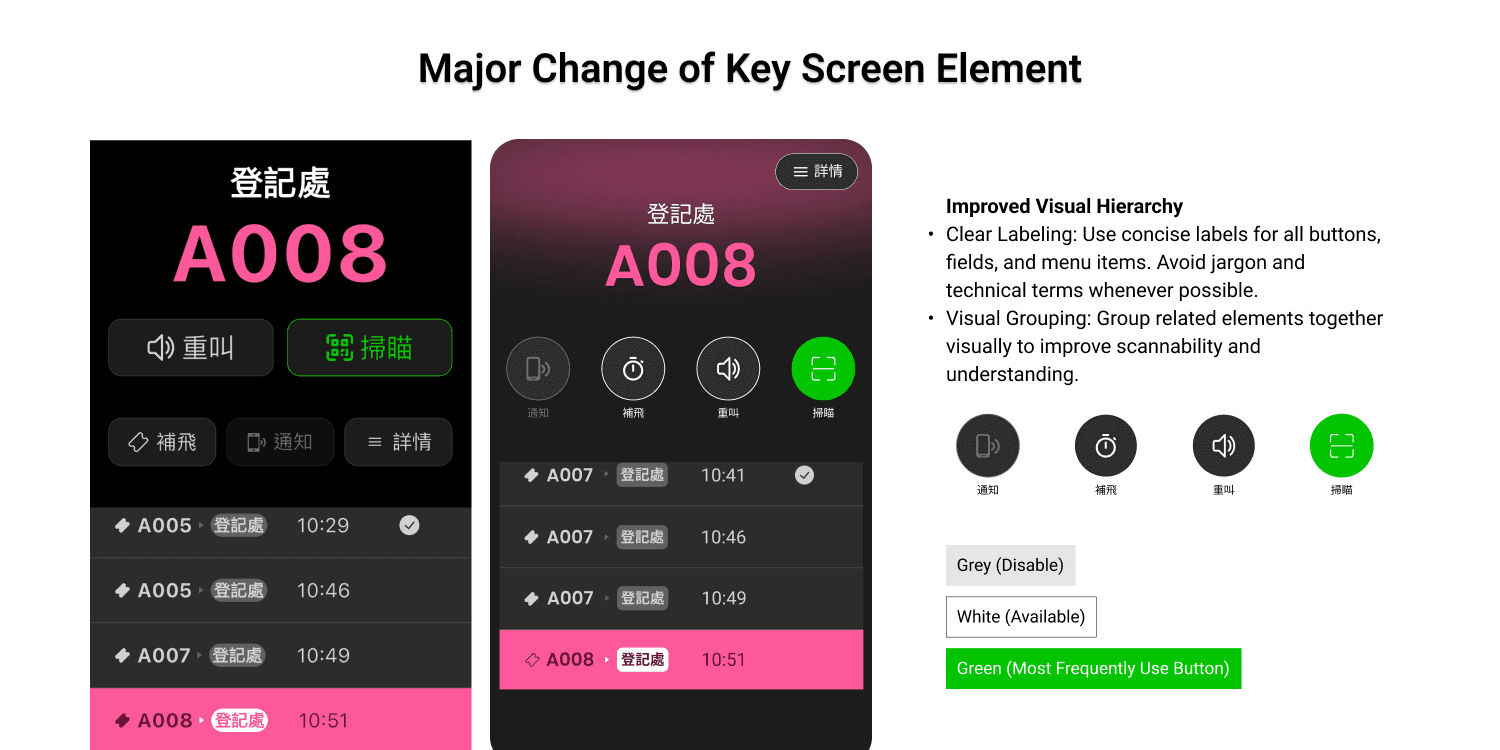
Addressing Poor Visual Hierarchy & Unclear Navigation:
a. Improved Visual Hierarchy:
Consistent Visual Language: We establish a consistent visual language using same type of liner icon and spacing to guide the user's eye and highlight important information.
Clear Labeling: Use concise and unambiguous labels for all buttons, fields, and menu items. Avoid jargon and technical terms whenever possible.
Visual Grouping: Group related elements together visually to improve scannability and understanding.
b. Enhanced Navigation:
Simplified Navigation Bar: Redesign the navigation bar to be more intuitive and user-friendly.
Contextual Menus: Provide contextual menus that offer relevant actions based on the user's current location within the application.
Positive customer feedback was received. In the meantime, ongoing review helped in identifying flaws before development execution and prevented any bad UX.
Upon observation, the Long Learning Curve and assistance requests have decreased. Engagement and task completion rates: + 12%
Overview
THE GULU's leading ticketing system used by over 3M+ customers across across the F&B, healthcare, and education industries.
ABOUT THE GULU >> https://biz.thegulu.com/
Role
As in-house designer for THE GULU, I validated concepts and optimized user workflows for their customer-facing applications, kiosks, and web portals. I collaborated cross-functionally with managers, tech teams, and stakeholders to deliver digital experiences that improved key metrics like engagement and task completion rates by 12%
Complex User Flows in Healthcare


The shop app has been used for several years without UI updates, while THE GULU is expanding ticketing system across F&B to healthcare industries.
Healthcare industries require more complex flows, such as check-in processes and queue transfers to different rooms for various diagnoses.

Problems Identified

Frequent Assistance Requests
Issue: Not only Users (Mainly Nurses), but also sales team, frequently need assistance and have questions about the flow and function.
Impact: Increases support workload and reduces user satisfaction.
Long Learning Curve
Issue: User interviews with clinic nurses indicated that it took an average of 2 Days to learn how to use the system effectively each time it was installed. Also, it revealed that the shop app UI felt outdated and unintuitive, leading to frustration and difficulty completing tasks.
Impact: Delays in onboarding and decreased productivity.
Poor Visual Hierarchy
Issue: Heuristic evaluation identified several issues with visual hierarchy, including unclear labeling, confusing button placement.
Impact: Leads to user frustration and errors.
Unclear Navigation
Issue: Navigation bar is not clear enough, users frequently struggled to locate key functions due to the unclear navigation bar.
Impact: Increases bounce rates and decreases user retention.
Research Methodologies

Our team prioritizes user research to inform design decisions, we partner with the Sales team to leverage their insights and access to users.
Conducted interviews with target users (specifically nurses) to gather qualitative data. Aimed to understand their challenges, and workflows.
Focus on Qualitative Data: We can identify pain points and opportunities for improvement. The goal is to create solutions that directly address user feedback and enhance their experience.
Solution

Addressing Frequent Assistance Requests & Long Learning Curve:
Simplified Workflow Design: Redesign the core workflows, particularly for check-in and queue management, to be more intuitive and efficient:
Task-Based Navigation: Organize the interface around specific tasks rather than relying on a complex menu structure.
Visual Progress Indicators: Clearly show users their progress through the check-in process with clear icon.
Clear Confirmation Screens: Implement confirmation screens after each critical step to minimize errors and provide opportunities for correction.
Error Prevention: Design forms with input validation and clear error messages to guide users towards correct data entry.
Addressing Poor Visual Hierarchy & Unclear Navigation:
a. Improved Visual Hierarchy:
Consistent Visual Language: We establish a consistent visual language using same type of liner icon and spacing to guide the user's eye and highlight important information.
Clear Labeling: Use concise and unambiguous labels for all buttons, fields, and menu items. Avoid jargon and technical terms whenever possible.
Visual Grouping: Group related elements together visually to improve scannability and understanding.
b. Enhanced Navigation:
Simplified Navigation Bar: Redesign the navigation bar to be more intuitive and user-friendly.
Contextual Menus: Provide contextual menus that offer relevant actions based on the user's current location within the application.
Positive customer feedback was received. In the meantime, ongoing review helped in identifying flaws before development execution and prevented any bad UX.
Upon observation, the Long Learning Curve and assistance requests have decreased. Engagement and task completion rates: + 12%
